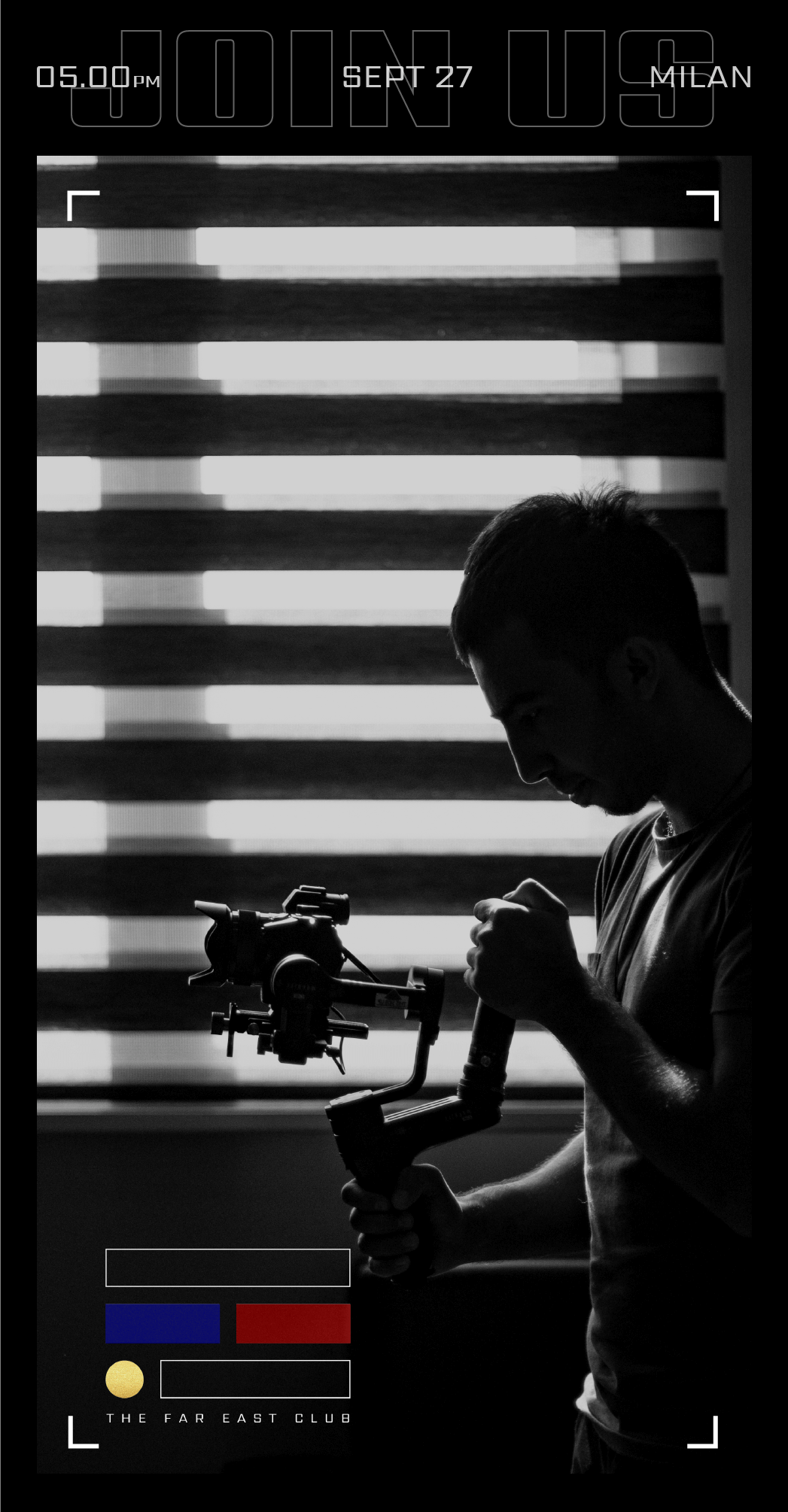
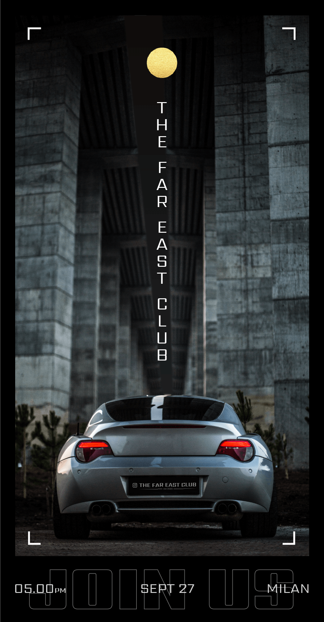
The Far East Club is a community of videographers who simply loves cars.
They organize car meetings where to ride, film and have fun.
They asked me to rebrand their image for a new start and a fresh change.
RE_BRANDING
RE_BRANDING
role: bRAND dESIGNER
client: THE FAR EAST CLUB
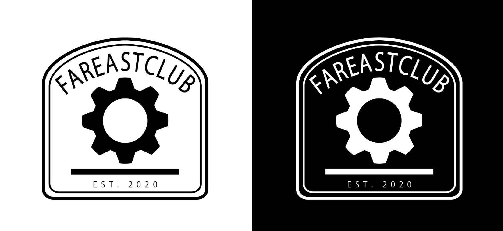
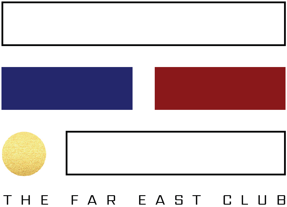
The original
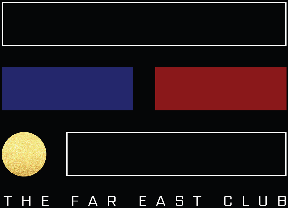
Proposed logo & variation
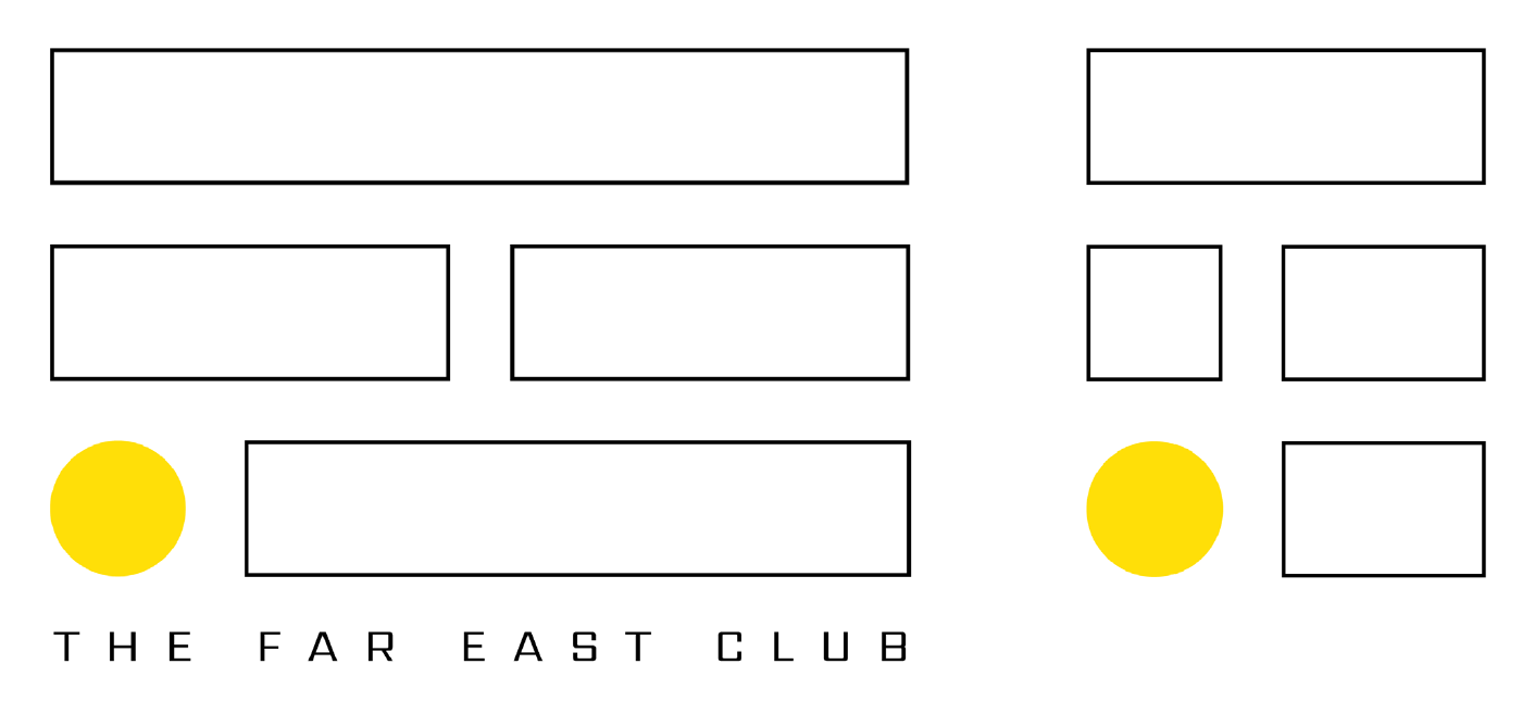
The logo summarizes the three main pillars of The Far East Club:
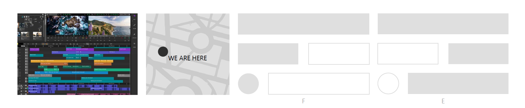
the who - videographers (video editor)
the what and where - car meetings (city map)
the origins - the sun, symbol of the Philippines
The rectangles recall the editing of a video, the streets of the city and the initials F and E of Far East, while the circle has a double meaning: origins (sun) and location (of car meetings).