

NABA X KLAMOO
___________ the project
metamorphosis
The project starts from the very definition of metamorphosis, the main theme.
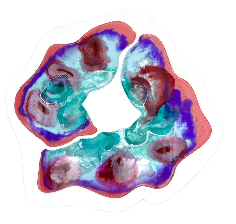
We identified a sub-category that takes into account the single element responsible for any metamorphosis: the cell.
And that’s where the “micro-morphosis” project comes to life.
The collection consists of three tables made of resin slabs inspired by three patterns referring to different cells:
plant (coffee table), animal (side table) and human (dining table).
Team:
Marilea Liantonio
Francesca Marciano
Jessica Marchese
( & of course me )
my Role:
Art Director
Graphic Designer
context:
Logo & Visual Identity
Out-of-home Media
( the cells )
( the cells )
( some prototypes )
___________ brand identity
microflow logo
The logo recalls the symbol μ (micro), the M of Microflow and the wave of a flow. The keywords of the brand are elegance and lightness, like the design of the collection.

= μ + M + flow

logo variations
